梗概
- 浮动之后, 会部分脱离文档流
- 行内标签和行内块级标签以及BFC的元素会自动环绕它。
- 当然文本也属于行内标签
实例:
脱离效果演示
原来的标准流:
 给div2添加
float:right属性:
 给div2和div3都添加
float:right属性:
div4被浮起的div2给盖住了

环绕效果演示
<!DOCTYPE html>
<html lang="en">
  <head>
    <meta charset="UTF-8" />
    <meta name="viewport" content="width=device-width, initial-scale=1.0" />
    <title>Document</title>
  </head>
  <style>
    .warp {
      background-color: red;
      border-radius: 20px;
      border-style: solid;
      border-width: 10px;
      border-color: green;
      box-sizing: border-box;
    }
    .a {
      background-color: blue;
      float: left;
      width: 100px;
      height: 100px;
    }
    .b {
      background-color: yellow;
      float: left;
      width: 100px;
      height: 150px;
    }
    .c {
      background-color: hotpink;
      border: 10px solid darkcyan;
      height: 200px;
      width: 100px;
    }
  </style>
  <body>
    <div class="warp">
      <div class="a">aaaaa</div>
      <div class="b">bbbbb</div>
      <div class="c">ccccc</div>
    </div>
  </body>
</html>
效果
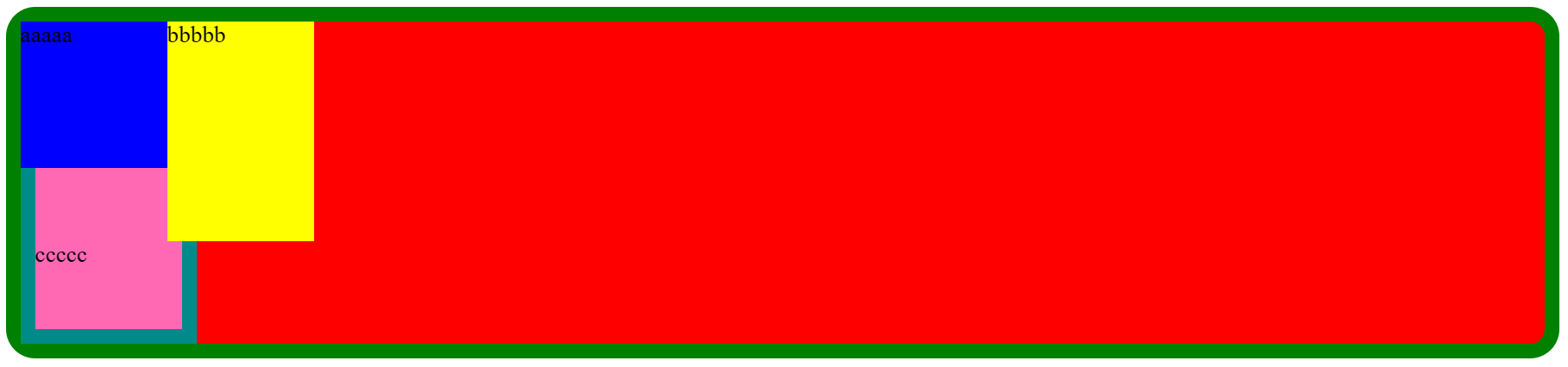
- 可以看到c的盒子被遮挡了,但行内文本会自动环绕到b的下方